I read an interesting article called “Is a six-month furniture subscription better than buying?” where Jessica Rénee Smith explored the idea that brands would design products for multiple temporary users rather than one owner and consumers would be able to change their furniture every 6 months. I think this is an interesting concept because trends are always changing and consumers like to keep up-to-date with these changing trends. Although the concept is interesting it may be difficult to put into practice. The scheme would need consumers to commit to changing furniture in the near future, it would require expensive transportation between customers and it is a lot of work to change furniture on a regular basis.
I will be interested to see if the scheme does get trialed in 2030 like proposed in the article.
Glasgow Trip
Last week I went to Glasgow and visited three art galleries, the Lighthouse, Kelvingrove and the GoMA. Throughout the day I walked around Glasgow and came across some interesting street art (shown below). I particularly like the left image because I find the artwork endearing, whereas I find the right piece more intimidating.


Once I got to the Lighthouse I viewed a graphic design exhibit. Throughout the exhibit there were a lot of interesting pieces (shown below). I enjoyed the different perspectives on the issues expressed in the posters.
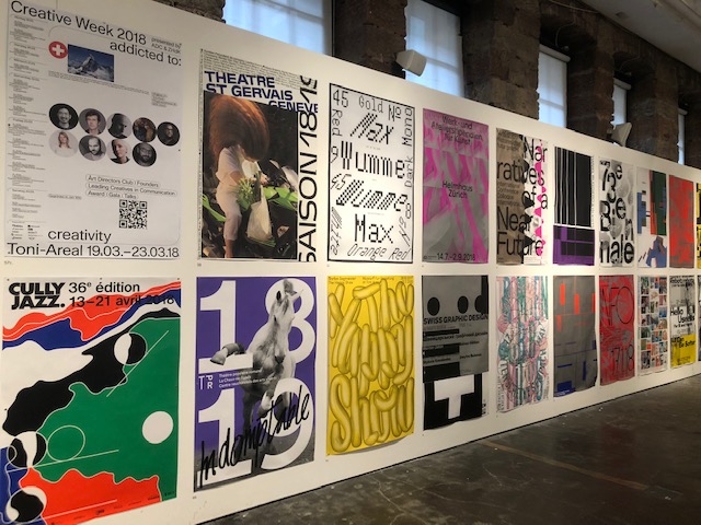
There was also a room of posters designed by younger designers. The two displayed below caught my attention because of their clever use of word play. Also I liked that younger people were being encouraged to explore their creative side and see what they could come up with.

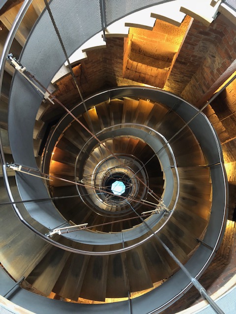
After the graphic design exhibit I climbed a tall spiral staircase to the tower where we could see all across Glasgow. I was mesmerised by the tower that we walked up to get to the viewpoint. I took the below picture from the top of the staircase looking down to a large blue light that sat at the bottom, in the middle of the spiral.
When I approached the Kelvingrove art gallery I was in awe of the beautiful architecture of the building. The orange colouring makes the building stand out against its background and my eye was drawn to the intricate detail in the brick work.


Inside the Kelvingrove gallery I wandered around the various exhibits there. I was first drawn to the immense size of the organ in the gallery that sits in the centre, this is also a very pretty piece. As well as this, the piece containing multiple hanging heads caught my eye. The coloured lights changed slowly which changed the atmosphere of the piece but what caught my eye the most was the uniqueness of the artwork. The final piece that caught my eye here was a structure made up of different shapes and pieces of different materials. I was drawn in by the textures and forms created within the piece.


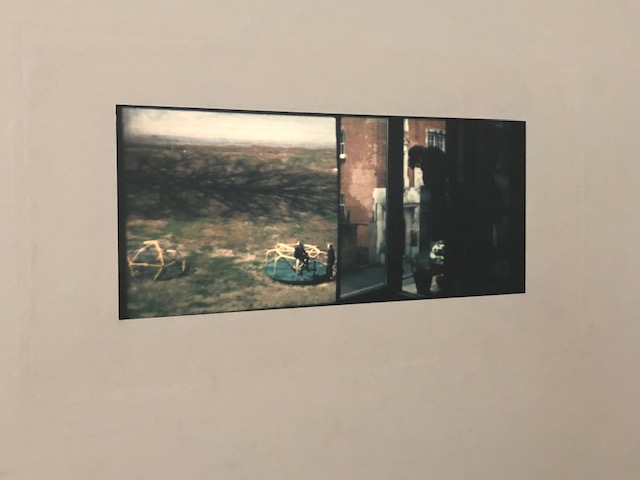
Finally I visited the GoMA. In the first exhibit there were two films playing, one was of fairly normal everyday things such as a cat running over a fence. The noise paired with this was neutral and I found this to be fairly dull. In another exhibit was a dark room displaying what seemed to be photographic contact sheets lit up by a light from a light-box beneath them. This was interesting because we were able to view many images across a large surface and also see the thought process of the creator of the imagery. The architecture of the building also interested me. This included the blue/green stained glass window, along with the oval shaped skylight and balconies that had a very pretty effect from the bottom.


All images were taken by myself.
F-Stop Stories
I recently read an article that is part of the ‘We Are F-Stop’ collection at http://www.fstopgear.com. This collection is great to read because it explores the industry and world of photography from the perspective of current working photographers in the industry.
I read the article, CITIES AND SUMMITS OF SCANDINAVIA WITH ANDREA HITZEMANN, which explores Hitzemann’s adventures around Scandinavia. From reading the article I am intrigued to explore the areas that Hitzemann travelled to and see what I myself can find there.
Attached to the article were some examples of the work that Hitzemann did throughout her trip (some of which I have inserted below). These photographs are very inspiring to me, both as a photographer and hopeful traveller in the future. I enjoy the lighting, reflections and framing of her images.


I like the way that the article has been laid out on the website. The text has been cut into sections making it easy to read and not too overpowering. The inserted images throughout also make it easy to visualise the areas that Hitzemann travelled to as well as to imagine the specifics to what she talks about.
National Gallery of Scotland
I visited the National Gallery of Scotland and found some interesting pieces of art that caught my eye. The Monarch of the Glen is on the left below. This piece by Edwin Landseer caught my eye because the background is simply beautiful. From the colours in the sky, down to the tones in the mountains and grass along the bottom, Landseer has beautifully framed the animal in the front and centre of the piece. The high level of detail is continued here as well as there being good tone in the shadows on the animal. Overall, this is a very pretty and captivating piece to view.


On the right above are two pieces showing a vast view of a hilly area. What I found interesting about these two pieces is that they almost fit together but don’t quite work as a continuation of the same view. They are in fact paintings of different places but the way that they have been placed briefly suggests that they could be a continuation of the same area. The choice of a misty day by the artist is interesting to me as it depicts silence and coldness. This is an interesting choice of atmosphere for a piece. This is contrasted by the red wall that the painting have been hung on because red suggests warmth and love which are two things that I don’t get from the paintings themselves.
Fruitmarket Gallery
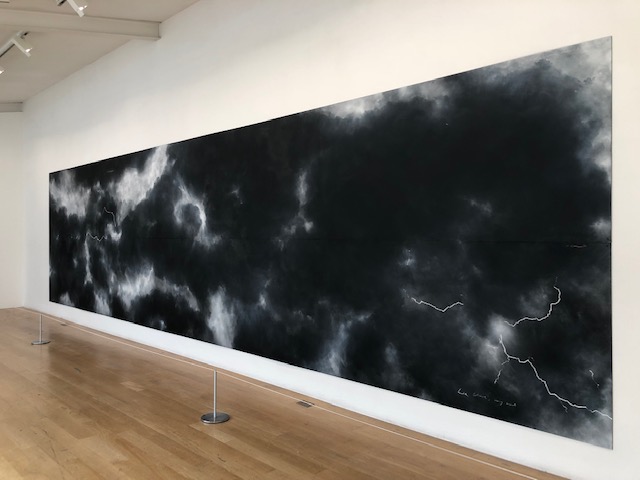
When I visited the Fruitmarket Gallery in Edinburgh, I saw a particularly interesting piece by Tacita Dean as part of her Woman with a Red Hat exhibition. The piece below is made completely from blackboard and chalk. The detail that has gone into the shading of the chalk is incredible. Also, I have been inspired by the way that Dean created each smaller blackboard and then pieced them together on the wall to create the finished piece, like a jigsaw puzzle. I could use this in my work by photographing something in sections to get finer amounts of detail and then later piecing the individual photographs together for the final result.
I was also drawn to a film that was projected onto the wall, shown below. Dean was able to shoot two different scenes onto the same reel of film by covering one half whilst exposing onto the other and visa versa. This technique is easy to do nowadays with the advances in digital technology that we have, however, at the time this was done, this was not possible to do so easily. I am fascinated by the fact that Dean experimented and figured out how to go about this using the tools that she had to hand which were limited.
Talbot Rice
Earlier in the academic year, I visited the Talbot Rice museum. Here I saw the exhibition by Lucy Skaer, The Green Man. Skaer’s work is all about telling a story with materials. For example in one piece she uses materials such as glass and bronze to represent animals and objects. Skaer then lays these out in such a way that it tell the story that she has taken from a poem.
I was particularly intrigued by Skaer’s piece called Sticks and Stones. In this piece, Skaer created a piece of art using sinker mahogany with inserts of porcelain, limestone, tin, coins, copper, American walnut, tiger’s eye, carnelian and Tasmanian black wood. She then passed this piece onto a ceramicist who attempted to recreate the original piece using the tools they had at hand. Then the ceramic piece was passed onto someone with marble and they used only the previous piece to create their interpretation. This was repeated using aluminium, ply and maple with oak veneer, paper pulp, slate and finally jesmonite. At each stage the creators were only able to see the previous piece.
What drew me to this piece was how different each material made the piece feel. The atmosphere changed with the material that the art was made from and not much of the physical shape was changed.


Dundee Visit
Last week I visited 3 galleries in Dundee. These were the V&A, the Dundee Contemporary Arts Centre and The McManus. Each gallery offered a different angle on art and photography. The V&A was interesting because there was such a wide range of art within the same exhibition.


Above on the left there is a very detailed model of the Scott Monument which has encouraged me to think about the smallest details in my work, however insignificant these things may seem. In the middle is a light situated in a purple glass box. The small side room had a few of these dotted about it. The colour of the light set a certain tone to the room of warmth and homeliness which was complimented by the strong wood smell. Finally the far right is a white dress which has been designed for a bride on her wedding day. I was taken in by the ruffles in the skirt of the piece because they demonstrate symmetry which is aesthetically pleasing to the eye.
However, my most preferred gallery of the day was the Dundee Contemporary Arts Centre. I felt that the work here showed a story throughout and all of the pictures in the Santiago Sierra Black Flag exhibition were cohesive as a collection.


Above are some of my favourites from the collection. The main reason why I fell in love with this work is because they are all in black and white. The levels of contrast in the pieces are amazing and really captivated me as the audience. However the main piece of this exhibition was the black flag at the north and south poles.

Not only are these images stunning in their composition and framing, but the concept behind them is so strong and the way that the image from the south pole has been flipped upside down, below the north pole gives the piece a sense of realism because this is indeed where each location is in relation to the other.
All images have been taken by myself on my iPhone.
Jupiter Artland Visit
Recently I visited Jupiter Artland. Here I explored many pieces of sculptural artwork. I was particularly inspired by the different colours that were incorporated into some of the pieces. First the purple crystal like piece was very pretty and the different shades of the colour changed depending on how the light hit certain parts and the angle at which you looked at a particular area of the wall. Also, there was another piece that had splashes of paint on a grey concrete structure which made the piece more interesting.


I was also inspired by the nature that was used in the pieces below. The left piece was particularly beautiful because of the wide range of coloured flowers in the bushes along the walkway. The bushes are also very naturally shaped whereas in the right piece the land has been more structured to look the way that the artist wanted it to look. I also like the piece on the right because all of the lines flow together, giving the piece a sense of rolling movement and fluidity which is calming. This contrasted the weather on the day that I visited because it was very cold and windy.


The next piece that caught my attention was the piece with the rifle leaning against the tree. What inspired me about this piece was the large scale to which the rifle has been made but also that it is to scale. The piece creates a sense of being small and overpowered by the large sculpture that towers over you. I also like the level of detail that has gone into the design on the rifle, for example the pattern on the trigger guard.


As well as this, I was also drawn to the oversized shoe. However, with this piece I was intrigued more so by the pots and pot lids that the piece had been created out of. The artist has very cleverly created a high heeled shoe using the unconventional material. I also enjoyed experimenting with taking photos using my reflection on the materials used.


Finally, the 4 images below are of some of the other pieces that caught my eye on my walk round Jupiter Artland. The first is of a girl shielding her face. There were many of these structures dotted around a small area which were stood or sat in different positions. The second is a structure displaying the words ‘YOU IMAGINE WHAT YOU DESIRE’ which I find to be an inspirational quote encouraging people to think creatively. The third image shows a signpost to Jupiter. I like this piece because the idea of Jupiter is a surreal thing to me because it is so far away and cannot be seen with the naked eye. However, the signpost showing the distance and direction to Jupiter makes the planet a more realistic thing which of course it is. The final image is a short depth of field photograph using a spiderweb piece which was covered in many different colours. This caught my eye because I was able to use the piece for some interesting photography work.


All images were taken by myself on my Nikon D60.
