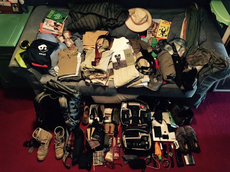
Below I have attached the presentation that we used to present our final project to the rest of the class.
Alternative Tourist Experience Project
After we were given the brief for the project, we sat down as a group and brainstormed ideas. We jotted down anything that could possibly work, no limits. This meant that we could then narrow our ideas down to those that are realistic but also still creative.
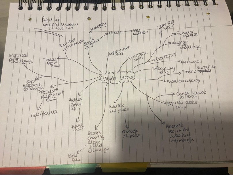
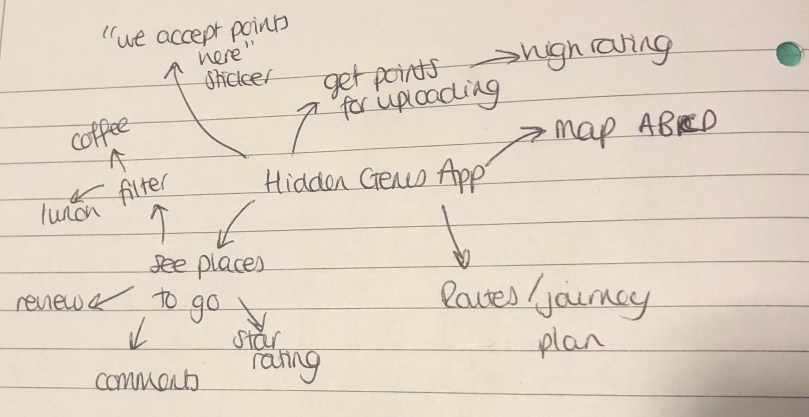
After our initial brainstorm we talked through our realistic ideas. Between us we decided that the ‘Hidden Gem’ app for your phone would be the strongest direction to go in. This would be an app for a smartphone that you can use to find places to visit in Edinburgh that aren’t the typical tourist sites. After we decided this we thought about the other features we could add to the app to make it unique and stand out from other apps on the app store (apple) and play store (android).
Following this we wanted to make sure that our idea was something that would be used by tourists and also something that was unique to the market. I put together a SurveyMonkey survey and we each shared the link on social media platforms to get as many responses as possible. We were very successful in getting back 100 responses very quickly and we felt that this was a good number to work off.
The questions that we used in the survey were:
- Where do you search for travel information?
- When visiting somewhere, do you like to see the typical tourist attractions?
- Would you be interested in visiting places that aren’t necessarily ‘typical tourist’ places to see?
- If Yes to the previous question, where would you go to find information on other places to see?
- Do you know any places worth seeing in Edinburgh that aren’t necessarily one of the typical tourist places to go? This may include coffee shops, park areas, restaurants, statues or anywhere else worth seeing
Each question had multiple choice options as answers and also some had a comments box for respondents to leave a different answer if theirs wasn’t part of the multiple choice or if they had a suggestion to offer (last question only). Below I have entered screenshots of the results of the survey.
After we collated the results of our survey, we concluded that it was successful and supported our idea as a product that would be welcomed by tourists in Edinburgh.
We then took a walk around the city as a group to see what hidden gems we could find that could go onto the app. We did this to ensure that there were at least a few places throughout the city that would fit what we’d be looking to be added to the app for users. Below are two examples of what we found that we felt fit the ‘Hidden Gem’ image that we were looking for.

The Gardener’s Cottage

Cainrgorm Coffee
After the success of our primary research, I did some secondary research to back up our decision to continue with our app idea. I found the following facts out:
- 58% of people prefer to search for travel on an app rather than a site
- 35% like the immediacy of push notifications that keep them up to date
- Almost a third of travellers use apps for promotions or discounts in travel
- 77% of smartphone users regularly use navigation apps
- 67% of users use Google Maps as their preferred app, next is Waze at 12%
- 25% say it offered better directions
With the support of all of our primary and secondary research we were confident that our idea would be a successful one.
Next Matt did some initial sketches of that we thought the main pages of the app should look like. Jamie then created more detailed versions of these with colour and then we used these to create the photoshopped phone screens below. These allowed us to see what would be practical as well as attractive as an app for users.


Screen 1 – Map

Screen 2 – Hidden Gem

Screen 3 – Options

Screen 4 – Points
The features of the app are as follows
- ‘Hidden Gems’ – places uploaded by users with a review, star rating and filter to allow users to search for specific categories e.g coffee shops
- Map – to visually show users where all of the ‘Hidden Gems’ are around Edinburgh
- Journey planner – shows users ‘Hidden Gems’ on their route or creates a route based on the ‘Hidden Gems’ that the user wants to visit
- Point system – users that upload a ‘Hidden Gem’ will gain points and these points can be used to purchase things in the ‘Hidden Gems’
We feel that the app that we have created is different to anything available at the moment because of it’s route planner feature. This feature allows the user to see ‘Hidden Gems’ that are on their route by them telling the app where their destinations are for the day, tourist or otherwise. The route planner can also plan the users route for them based on the ‘Hidden Gems’ that they have decided to visit. We would ensure that this feature was user friendly and simple to use.
The group consisted of 4 people:
- Rachel Duncan – Photography
- Alexander Haughey – Graphic Design
- Matthew Capes – Product Design
- Jamie Jalland – Interior and Spacial Design
Richard Hamilton Collage
Throughout this module I have been working on the piece below. This is an interpretation of pop artist, Richard Hamilton’s iconic photo-collage “Just what is it that makes today’s home, so different, so appealing?” (1956).
The meaning behind my interpretation is about how nowadays the world seems to revolve around technology, regardless of what is going on in the outside world. In my piece you can see two people sat inside using many forms of technology to entertain themselves even though they are in each other’s company and regardless of the lovely weather outside.

Market Street Gallery
Earlier in the academic year I visited the Market Street Gallery. I viewed a photography exhibition with a wide range of interesting pieces. The two images below display the two pieces that I was most drawn to in the exhibition.


On the left is three pieces that are a collection of images of benches that have been placed with the purpose of being a memorial for somebody. The collection documents peoples everyday lives around these wooden benches which are all similar in appearance but hold very different stories and are in unique places around Edinburgh. I was inspired by this work because of the deep meaning behind it as well as the interesting composition of each photograph.
The right image displays a piece by Ron O’Donnell, one of my lecturers at Edinburgh Napier University. Within the photograph is a piece of art, constructed by the photographer. This method is interesting and I think it is very effective in creating a unique and eye-capturing photograph.
F-Stop Stories
Having been greatly inspired by the previous stories I have read, I have continued to read through many of the f-stop stories at http://www.fstopgear.com. A story that particularly caught my attention was ‘EXPLORING OLD TOKYO WITH THE NEW URBAN SERIES’. I was drawn to this mainly because Tokyo is somewhere that I would love to explore with my camera someday so I decided this would be a good story to read to gain some knowledge from those who have done.


The article has been broken up by the use of photographs taken on the trip. This makes the piece easy to read and also gives the reader a visualisation of what the writer is taking about. I love the composition of the images that I have attached above, these particularly caught my eye when reading the article. I feel that they really capture the culture of the city and the people within it as well as having a beautiful liveliness about them.
I particularly like the black and white image with the break dancer because the tones are really strong and although there are only a few people in the frame, there is still a really big sense of culture throughout it.
https://fstopgear.com/stories/events/exploring-old-tokyo-new-urban-series
Museum of Modern Art
At the weekend I visited the Museum of Modern Art (1 and 2). Throughout both museums there were some very interesting and inspiring pieces of work but also some pieces that I found to be disappointing.
Below are two pieces by René Magritte that I was drawn to. The top painting was originally square but Magritte decided to cut it down and frame it uniquely.


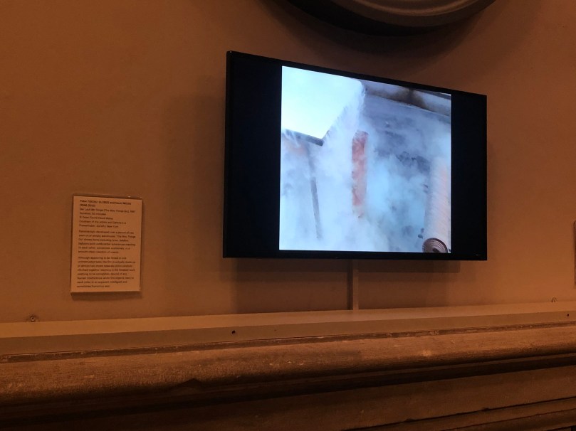
In the next room was this screen displaying a video creation by Peter Fischli and David Weiss. The video seems to be made of one consecutive film however after reading the blurb next to the screen I read this it was actually made up of almost 24 tapes that were brilliantly edited together.
Next I viewed an exhibition by Andy Warhol. I was drawn to the simplicity of the two top pieces (below) as they hold a lot of emotion despite the lack of colour within them. This is interesting because a lot of emotion is conveyed through colours in art. The pop art piece of Marilyn Monroe is a very famous piece that I am honoured to have now seem in person. The colours throughout this piece are very vibrant and this was definitely the first thing that I was drawn to when entering this room. I was also drawn the the Absolut Vodka bottle piece. This is because black is not often a colour associated with vodka because vodka is a clear liquid and a lot of the branding for vodka is white or clear (unless for a flavoured vodka where it holds the same colour as the flavour). Finally I was drawn to the collection of 4 ‘Halston’ pieces because they are very clumsy and convey a sense of everyday life which is relatable.


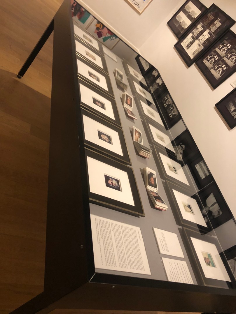
I was particularly drawn to the table below. Behind this glass shield was many portraits done by Warhol, both of himself and of other people. The have been taken on a polaroid camera which makes each piece unique and one-of-a-kind. As a photographer myself I love the idea of a one-of-a-kind piece and I look forward to experimenting with different techniques for this in my degree course.
Below, left, is a poster by Warhol which I was drawn to because of its realistic style and creative typography. I am very inspired by Warhol’s style and techniques.
Finally, the piece on the right below is one example of the pieces that I found to be disappointing. The range represented by this piece were very clumsily put together and I felt that they had a very childish way about them in the way that they reminded me of my high school art projects.


All photos were taken by myself.
F-Stop Stories
Recently I read another of the ‘WE ARE F-STOP’ series called “FEELING ALIVE IN ARFICAN WILDLIFE WITH WILLEM BAKHUYS ROOZEBOOM”. In this piece Roozeboom talks about how he got into photography after being in a corporate job for too long and about his travels around Africa after he made his career change.
I am very inspired by Roozeboom’s story about a change in career as I think this is something that not enough people are comfortable to do, even though they are miserable in their current work.
What inspires me most about this article is the insane photography by Roozeboom. The angles that Willem has been able to achieve is amazing and in the article he explains how he lies under his car in order to observe an animal stroll past close enough for this level of detail and this incredible angle.


Roozeboom’s attitude to the art of photography is also very encouraging as he takes every opportunity he can to get out into the wild with his camera and his other f-stop equipment.
I personally can relate to this attitude as I am aspiring to travel all over the world with my camera in the future, hopefully as a career.
After reading the article in the ‘We Are F-Stop’ series, I looked further into Roozeboom’s work through his Instagram profile (attached to the end of the article) and I am continually inspired to travel and try wildlife photography which is something that I have not tried much of in the past.
https://fstopgear.com/weare/we-are-fstop-Willem-Bakhuys-Roozemboom
T-Shaped Individual
Throughout the module I have been working on my T-Shape. This is a piece of work that demonstrates my interests and skills within my field of photography but also across other disciplines such as fashion, graphic and product design. The vertical leg of the T displays my discipline and the horizontal leg demonstrates everything else.
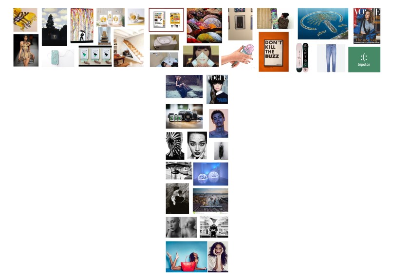
From left to right on the top of the horizontal leg is Begg and Co Scarves (fashion design), Rene Magritte (inspirational artist), colourful and inventive art techniques, creative pasta packaging, inventive storage, inventive pasta measurer, a clever umbrella scheme in Japan (similar to the Boris Bikes of the UK), attractive Japanese designs, creative posters, graphic designs on the underside of snowboards, the architectural design of the palm island in Dubai, Vogue magazine cover (fashion design as well as fashion photography). On the lower level of this is, Jean Paul Gautier (fashion designer), creative earphone storage design (product design), creative paper towel dispenser design (encourages people to help the environment), under stairs storage, toilet for double use of water (sink water fills toilet), tablet holder design, creative napkin design, easy whisk cleaner, word play on a poster, snowboard designs, jeans and clever graphic design on mental health.
From top to bottom of the vertical leg of the T-shape is fashion photography, a Vogue cover using studio photography, film camera, portrait photography, interesting shadow portraiture (Wendy Hope), Irving Penn images (inspiring photographer from my college studies), Trevor Williams (light photography), David Basanta shadow photography, Ben Sasso photographer, long exposure landscape photography, candid street photography and inspiring models Jeana Turner (alopecia) and Winnie Harlow (vitiligo).
All of the images on the T inspire me in my field and will help me when collaborating with people in other fields.
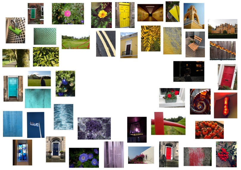
Personal Colour Wheel
Since the beginning of this module I have been collecting images in order to form my own colour wheel. I focussed mainly on red, orange, yellow, green, blue and purple but also documented shades in between in order to create a flow of colours in the circle.
Smashing Magazine
Recently I read the article from the link below. The article explores graphic design in small places such as on book covers, album covers, film titles, money and stamps. I was particularly drawn to the sections on album covers and stamps. This is because they are such small areas but they prove that design doesn’t need a large space to be effective. In my personal opinion I prefer design that is simple and uncomplicated as it sends a clearer message and is more aesthetically pleasing to view.
I also like the set up of the article as it is spaced out and easy to read. There are also collages of images throughout which make it a nice visual piece. This is also fitting for the topic of graphic design.
I can take inspiration from this work in my own as I like the simplicity of the writer’s thoughts and although I may not apply the same ideas visually, the thought process is a positive one to consider.
https://www.smashingmagazine.com/2016/03/inspiring-graphic-design/
