At the weekend I visited the Museum of Modern Art (1 and 2). Throughout both museums there were some very interesting and inspiring pieces of work but also some pieces that I found to be disappointing.
Below are two pieces by René Magritte that I was drawn to. The top painting was originally square but Magritte decided to cut it down and frame it uniquely.


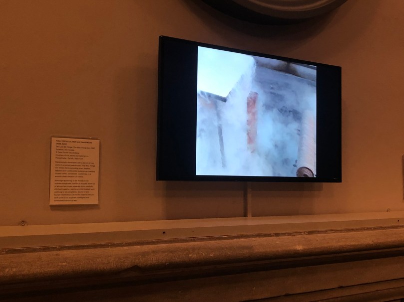
In the next room was this screen displaying a video creation by Peter Fischli and David Weiss. The video seems to be made of one consecutive film however after reading the blurb next to the screen I read this it was actually made up of almost 24 tapes that were brilliantly edited together.
Next I viewed an exhibition by Andy Warhol. I was drawn to the simplicity of the two top pieces (below) as they hold a lot of emotion despite the lack of colour within them. This is interesting because a lot of emotion is conveyed through colours in art. The pop art piece of Marilyn Monroe is a very famous piece that I am honoured to have now seem in person. The colours throughout this piece are very vibrant and this was definitely the first thing that I was drawn to when entering this room. I was also drawn the the Absolut Vodka bottle piece. This is because black is not often a colour associated with vodka because vodka is a clear liquid and a lot of the branding for vodka is white or clear (unless for a flavoured vodka where it holds the same colour as the flavour). Finally I was drawn to the collection of 4 ‘Halston’ pieces because they are very clumsy and convey a sense of everyday life which is relatable.


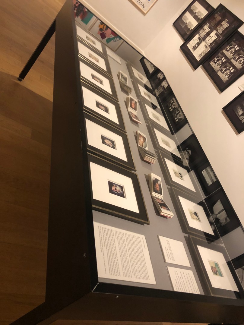
I was particularly drawn to the table below. Behind this glass shield was many portraits done by Warhol, both of himself and of other people. The have been taken on a polaroid camera which makes each piece unique and one-of-a-kind. As a photographer myself I love the idea of a one-of-a-kind piece and I look forward to experimenting with different techniques for this in my degree course.
Below, left, is a poster by Warhol which I was drawn to because of its realistic style and creative typography. I am very inspired by Warhol’s style and techniques.
Finally, the piece on the right below is one example of the pieces that I found to be disappointing. The range represented by this piece were very clumsily put together and I felt that they had a very childish way about them in the way that they reminded me of my high school art projects.


All photos were taken by myself.
